
Even though Times New Roman is one of the most popular fonts in the world, it is not beloved by many users. What has led to this situation?
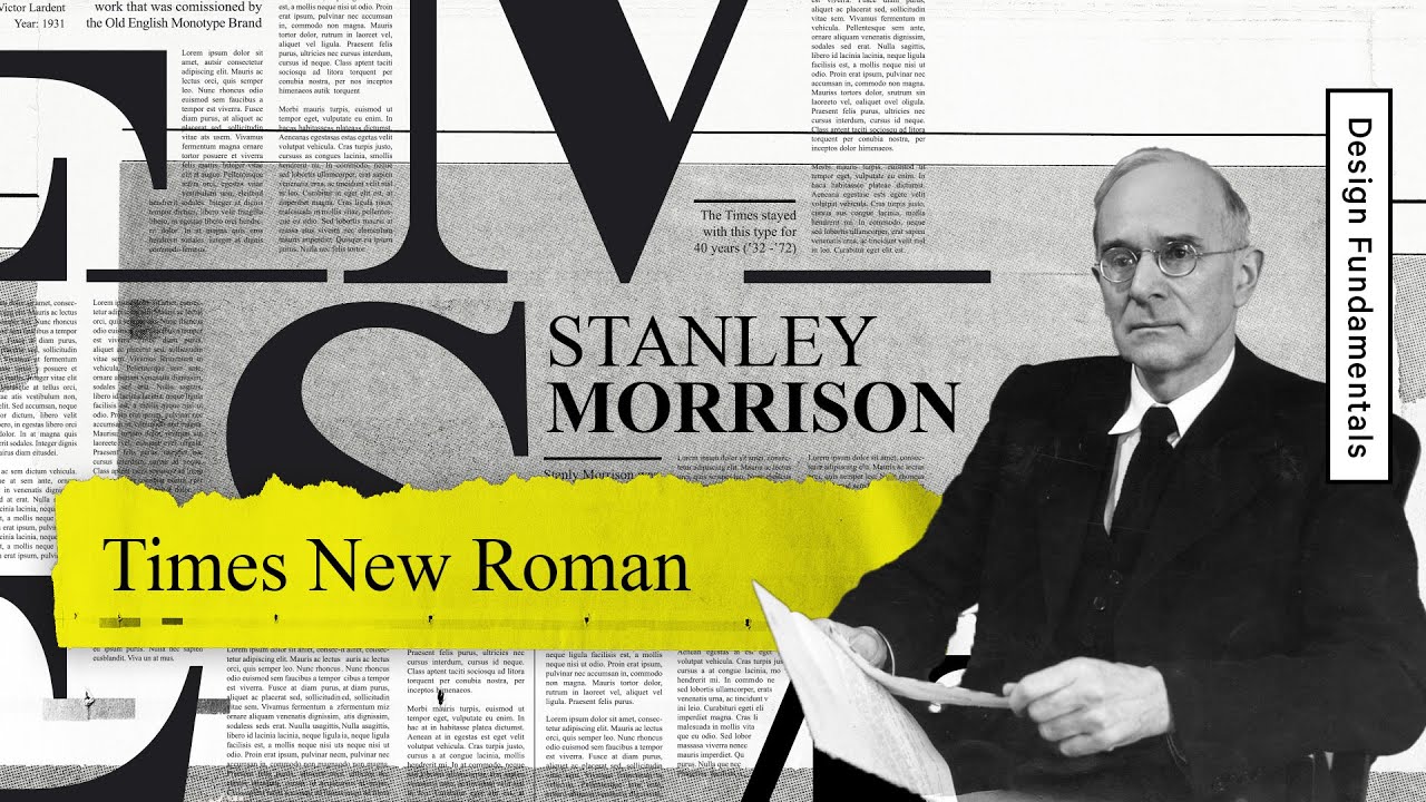
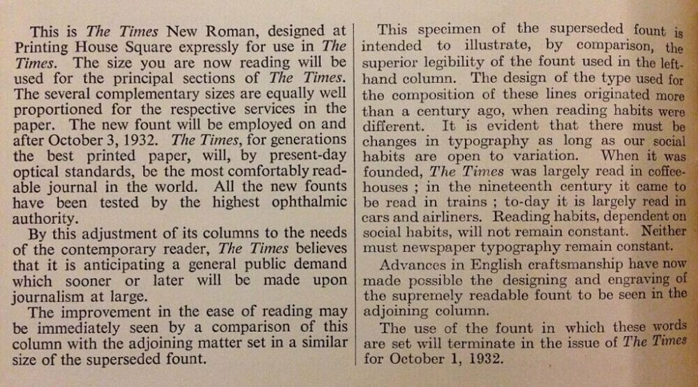
First introduced in 1931 in the British newspaper The Times, the Times font, also known as the "great dynasty," replaced its outdated predecessor and quickly spread worldwide. The most famous members of this "great dynasty" include Times and Times New Roman.
This font has been present in every version of Windows since 3.1 and was once the default font in many applications, including Microsoft Word. Times New Roman has been widely accepted in classrooms, offices, and even became the official font for all U.S. government diplomatic documents in 2004.
However, times change, and no king reigns forever.
The abdication of Times New Roman
The replacement of the Times New Roman font at the U.S. Department of State has caused much controversy.
In early 2023, the U.S. Department of State officially announced the replacement of Times New Roman with Calibri for all documents. According to internal documents, the goal of this change was to help employees read text more easily on screens.
However, this decision met with mixed reactions. U.S. government employees were so accustomed to Times New Roman that they expressed dissatisfaction with the new change. Many even mocked it as a "sacrilegious" act and predicted that sooner or later, someone would rise up to demand the return of Times New Roman.
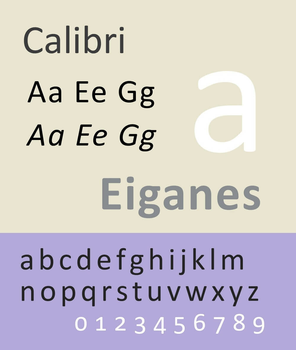
The shift from Times New Roman to Calibri was not a revolution, but a reasoned change. The classic style of Times New Roman, with its intricate serifs, has been judged by designers as outdated in a modern context.
Many brands have replaced Times New Roman in their logos with more modern fonts like Helvetica to create a cleaner look.
However, the main reason the U.S. Department of State chose Calibri was readability. In the digital age, when information is primarily displayed on screens, font readability becomes more important than ever. The intricate serifs of Times New Roman can cause difficulty for electronic device users when displayed on screens.
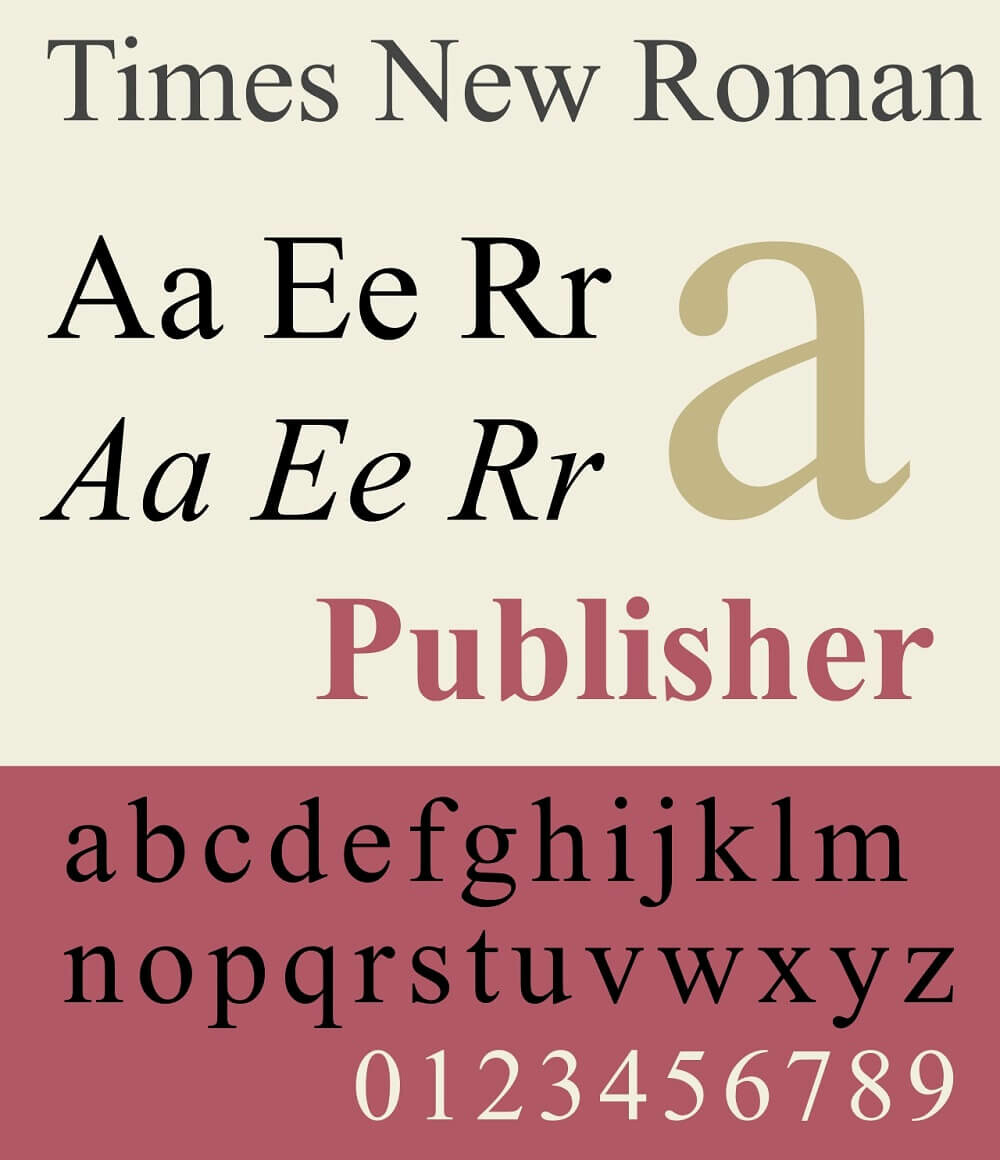
But why hate a font?
The truth is, no matter which font you replace "Times New Roman" with, you will still find a community that passionately hates it. In fact, the history of Typography enthusiasts is full of hated fonts.
In the era of the Internet connecting everyone, those who hate certain fonts have found "common enemies" and formed communities to voice their shared opinions. Online, there are communities calling for the removal of Papyrus, groups that hate Comic Sans, and those who despise the "basic" Arial font.
Every community has its own preferences, and "hating" a font is no exception. According to analysis by expert Allan Haley, Director of Words and Letters at Monotype Imaging and a typography design expert, there are four main reasons why a font is hated.
First, a font can be overused, leading to boredom and aversion. Second, a font may be a copy of another font, lacking uniqueness and creativity. Third, the quality of the font may be poor, making it difficult to read and use. Finally, some fonts are simply "annoying" due to quirky or unappealing designs.
The debate over fonts and font design seems like it will never end, especially as trends change unpredictably. In internal documents from the U.S. Department of State, the drafter mentioned using Calibri for future documents because this font had been chosen by Microsoft as the default.
However, in 2021, Microsoft announced it would soon replace Calibri. After 17 years of dominating Office software, Calibri had to make way for Aptos, the new default font for Microsoft's content creation software.
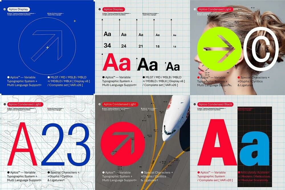
Microsoft stated that Calibri had been the default font for all its products since 2007, when it replaced Times New Roman across the entire Microsoft Office suite. "It has served us well, but we believe it is time for a change."
Analyzing why a font is hated, criticized, or out of favor is unnecessary. As a famous designer once said: "A great font is one that is recognized even before people read what the word is." This applies to both beloved and hated fonts.
Sometimes, liking or hating a font is simply because it evokes a feeling of cuteness or discomfort.